Roaring Stories
Bridging readers and experts through trusted reviews and information

Roaring Stories is a bookstore located in Balmain, Sydney.
It plays a vital role in cultivating a deep, symbiotic connection with your local community. This enchanting haven of literature often serves as more than just a point of sale, but it has become a cultural center and social anchor.
OVERVIEW &GOALS
Roaring has a team of experts who, in addition to being voracious readers and critics, have been part of the book's trajectory for years. This team curates its selections with a deep understanding of local interests, reflecting the community's tastes and values and promoting a sense of intellectual engagement and belonging.
The main opportunity is to strengthen this connection with the community, keep its old customers, gain new ones, and retain them through the website that reflects the personalized service of its team of experts.
Role
UX/UI Designer
Team
Me, myself and I
Scope
2 week design sprint
Methods
Business Analysis, Heuristic Evaluation, User Flow, Competitive Analysis, Archetype, Scenario, Problem Framing, Sketching, Usability Testing, Prototyping.
Tools
Pen & Paper
FigJam
Figma
Google Docs
Canva
My brain!
Project Type
Conceptual
Discover
How I made it
With the research previously conducted, the next step in the process was to define the purpose of our solution.
The focus was defined on the product details page, which may contain more information not only about the book, but also evaluations and recommendations from both the bookstore's team of experts and the community in which it operates.
Methods: Problem Framing, Sketching, Usability Testing, Prototyping.
Define
Solution
What I delivered
Client documentation and prototype including:
-
Customisation of the product details page, including reviews and recommendations directly from the staff
-
Personalized homepage with brand elements and store images, bringing a feeling of familiarity
-
Navigation bar reorganised and categorised in an objective way;
-
Standardisation and hierarchy of pages and content to achieve consistency
-
Checkout process optimisation
Tools: Figma, Canva
Discover
-
Business Analysis
-
Heuristic Evaluation
-
User Flow
-
Competitive Analysis
-
Archetype and Scenario
-
Problem and Hypothesys
How I found out
Business Analysis
I understand that Roaring Stories is a consolidated independent bookstore (with over 50 years in business), which is proud of its history and the relationship with its customers throughout of generations.
Within this, there is a special highlight for the team, which, even after the sale of the bookstore in 2019, was maintained because it is considered book specialists.
Evaluating the website experience, including prices, categories, and inclusion of sections such as events and a blog fed by the staff with information not only about books but local events and others related to the context, I believe that the main objective of the bookstore is to strengthen this connection with the community, keeping its old customers, gaining new ones and retaining them through personalized service.
Therefore, the archetype used was Careful Critic, a customer who cares about quality and who can pay a little more for what Roaring Stories has to offer.
Heuristic Evaluation
I carried out a heuristic evaluation to identify and propose solutions to usability problems, ensuring adherence to design principles and improving the user experience. Here are some pain points/opportunities:
Navigation
-
Return to homepage: there is a navigation problem caused by the separation of the bookstore x store websites that prevents the user from returning to the bookstore's Homepage. When the user clicks on the bookstore logo, they navigate to the shop's home page. It is important to ensure that the user can easily return to the main home page (user control & freedom/consistency and standards).
Checkout
-
Progress bar: at the checkout stage we can add a better indication of the progress in the purchase finalization stages. We can currently see the steps and where we are, but there is no indication that the previous step has been completed (visibility of system status);
-
Button to return (back): there is no clear button to return to the previous step (user control & freedom);
-
Last Viewed: This category currently does not exist on any store page. Including the last books viewed by the user on the checkout page can be a good strategy to remind them of products they may have liked (recognition rather than recall).
Cart
-
There is currently no button to return to the shopping page/last visited page after checking out. However, there are two giant buttons to proceed to checkout (user control & freedom).
-
The user removes products from the cart without any confirmation questions or notifications. And if you have two units of the same book, both are removed. The expectation would be to remove only one and keep the other (error prevention).
Search
-
Chips: the search for products does not have chips (tags). We can insert them to facilitate the selection and identification of filters in a faceted search (visibility of system status).
Visual
-
Homepage image: when we access the website's homepage, the first image we see is a banner for the book of the month. This banner is constantly updated, which makes it difficult for users to familiarise themselves with the site. In this sense, changing the first image of the homepage to a photo of the bookstore entrance can be a good strategy to give the user a feeling of the real world and also make the site easier to recognise. The same can be done with the store pages, bringing an image of the inside of the bookstore (match between the system and the real world);
-
Layout/style: currently there is a different style between the bookstore pages and the store area. Because they are different sites, this divergence occurs. Standardising layouts, bringing familiar images and working on a composition of all pages together is an important step towards website consistency and user recognition (consistency and standards);
-
Background: the background used on the site is currently entirely white and generic. Inserting a background with the same gray texture as the bookstore walls can bring a feeling of familiarity with the real environment (match between the system and the real world);
-
Change the “Cart” for a “Bag”: The shopping cart is a common icon and already established as a reference, there are no problems using it. The shopping bag is also common sense. When we go to a bookstore, we usually don't use carts, but we leave with a bag (match between the system and the real world).
User Journey
The construction of the User Flow made it clear that the most important page would be the “Product Detail” page, which could be decisive for the purchase of the Careful Critic archetype.
And then I started focusing more on this, thinking about the important features and making some adjustments and refinements proposed in the feedback rounds and in the context analysis and other bookstores.

Competitive Analysis
The competitive analysis was carried out by comparing important items for the target user, a careful critic. Websites from 5 other bookstores were evaluated and compared to what is currently offered on Roaring Stories's website.
In addition to the analysis itself, I used these sites as inspiration for my design, such as the Dymocks market which has an area with product information, reviews and delivery information. And in the case of Book Face, the visual design brings a sense of experience inside the bookstore with well-used images.
.png)
Archetype & Scenario
Miranda, a 38-year-old woman from Sydney, Australia, is excitedly planning a road trip with her family across the stunning landscapes of Australia. Her family consists of her husband, David, and their two children, Emma (10 years old) and Liam (8 years old).
As part of their preparations, Miranda wants to ensure they have a collection of books to read every night during their journey to keep the family entertained and promote reading for her children.
_edited.png)
Problem
Readers like to receive recommendations and find out more details about books before buying them, but there is no reviews associated with the product on the website. On the blog, the team of experts shares some reviews periodically, however this content is not easy to access or highlighted.
Hypothesis
A website that conveys the expertise of the staff through their recommendations and the reliability of reviews from the Roaring Stories reader community. Creating spaces on the product detail page and more recommendation areas in categories. Developing a familiar, safe, and reliable environment that results in satisfaction and assertive purchases.
Define
-
Problem Framing
-
Sketching
-
Usability Testing
-
Prototyping
How I made it
Problem Framing
To define the problem, I used the problem framing method to understand the core challenge users face before trying to solve it through design.
Sketching, Usability Testing and Prototype
After defining the problem, I started the first sketches and transformed them into low-fidelity wireframes for rounds of usability tests with potential users. Complete changes were made, in addition to the product detail page, according to the feedback received, such as adding suggestion categories in the store and improving the flow in the checkout process.
Product detail low-fi

Cart low-fi

Solution
-
Prototype
-
Client Documentation
What I delivered
As part of the solution, wireframes were developed for the Homepage, Shop, Product Details and the entire Checkout process, which are detailed in the next sessions. In addition, support material was developed detailing the research and decisions, as well as this case study.
Product Details Page


Staff Review integrated into the product page, making it clear to the customer why and who recommended it.


Author information
Reviews from other store customers and additional information that may be decisive in finalizing the purchase. Total transparency about the product.

.png)
Overlay with information about items in the cart (after clicking add to bag)
As the product details page was identified in User Flow as the most important for purchasing, I added clickable options for more detailed information.
Considering that the Careful Critic archetype does not buy on impulse and wants reassurance about the quality and reliability of the products.
Check Out Process

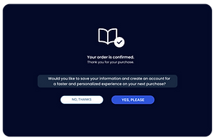


The checkout process is always a point of attention in any e-commerce. In this case, I reduced the steps to complete the purchase and designed the flow for creating the account after making the purchase. This means that the more bureaucratic and high-evasion steps of providing data and creating a password are offered after a great overall experience and, consequently, at a stage in which trust and affinity with the store is already established.

Homepage
Shop (Categories)

.png)
I worked on an aesthetic of familiarity to bring customers closer to the bookstore. Real photos of the entrance and interior of the store were used to bring this feeling and match the real world.
Reflection & Outcomes
In this work, especially because it was a case study so early in my career, I had limitations regarding access to users and the bookstore's potential audience. In this sense, the study was based on my assumptions and a small sample of users and colleagues from whom I received feedback and carried out usability testing.
Main outcomes:
-
Addition of important information about the product and delivery on the product detail page, to help the customer in decision-making;
-
Addition of space for reviews, using social proof bias as a potential converter;
-
Reduced checkout steps;
-
Inspired by the case of "The $300 Million Button", there is no need to log in or create an account to complete checkout, aiming for an increase of up to 45% in purchases.